The brief
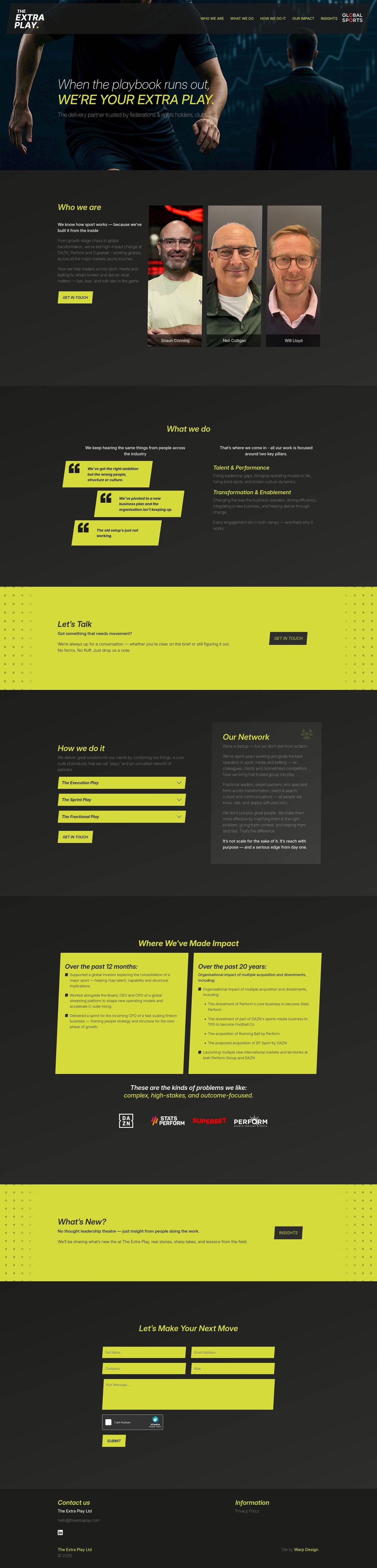
Not every brand wants to be calm and corporate — ExtraPlay needed a site that felt loud, fun and a little bit chaotic in the best way, while still being genuinely usable. Bold colour and confident type do the heavy lifting here, rather than long paragraphs of copy.
Design approach
The layout leans on strong colour blocking, oversized type and generous spacing to keep things punchy without ever feeling cluttered. Motion is used sparingly and deliberately, so the energy comes through in a handful of key moments rather than everywhere at once.
What went into the build
- A component-based layout so bold visual sections stay easy to rearrange and reuse.
- Careful contrast checks so a high-energy palette still stays accessible and readable.
- Fully responsive scaling of type and imagery, so the personality survives the jump to mobile.
Want a site with personality?
If your brand doesn't want to look like everyone else's template, let's talk.